Have you heard of the Dunning-Kruger Effect? It describes a tendency for people to misevaluate their own knowledge or competence on a subject. Experts underestimate themselves—and for laypersons to assume they know way more than they do.
I’m expert in fintechs. Plus, I’m a fast learner and I’ve helped credit unions roll out mobile banking apps for 25 years now. And I’m not an expert in mobile UI/UX, but I know what separates the good from the bad in banking apps.
Or do I?
Recently, I spoke with actual mobile UI/UX experts at BankingON. They work with credit unions to improve the mobile experience—and build CU-powered neo bank apps like Bank Dora. They recorded a 15-minute walk-through to show me what most people miss.
I immediately pulled up all 5 (yes, I’m weird) different credit union mobile apps I have (and they’re all market leaders). I went through each one. I couldn’t unsee what I’d seen. Once I’d seen the Ferrari of UI/UX in mobile banking apps, everything else looked like a Honda Civic. Yikes.
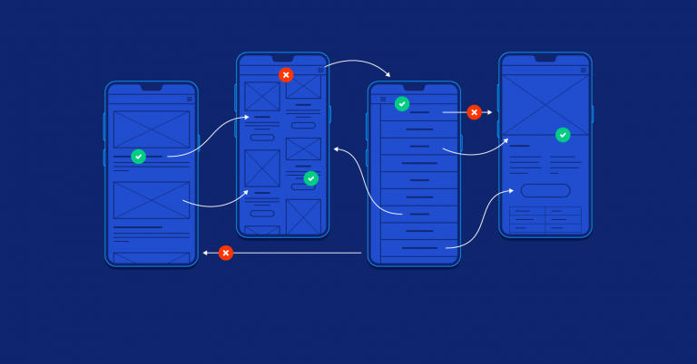
I’m going to show you what they showed me:
The 5 most common mistakes in mobile UI/UX in credit union banking apps. I’m sorry in advance—seeing this might make you realize that you’re not an expert in UI/UX either. It may make you realize your 4+ star app needs a bigger overhaul than you thought. But it may help your credit union get to the next level!
Top 5 Mistakes in Mobile UI/UX for Credit Unions
- A Poor Mobile Front Door: Ambiance or Bust
- The Mystery Home Screen: Guess Whose Account and Bank It Is?
- Navigation Nightmare: Hamburger/Bloated Menus
- Spinning Wheel of Death: Now Loading a Dead Relationship
- Engineers Are Not Designers: UX Is an Art, Code Is a Science
1. A Poor Mobile Front Door
70% of all banking takes place online. Your mobile app is the face of your credit union to all digital-first members… and to all digital first-timers, too! Give them the same experience you’d give to a branch visitor.
Here are a few examples of what not to do.
No curb appeal to this front door!
- Congratulations! You won the award for most boring and basic login screen in banking.
- Why is Touch ID banished to the bottom of the screen instead of the center where the user’s eyes go? (At least this app has biometric ID…)
- Wasted branding opportunity? Why is the logo hidden behind the login? What are you trying to hide?
- Too much text in the name and password. Nobody likes reading extra words.
 No biometric ID? You gotta be kidding me.
- People hate passwords. Give them a better option.
- Apple first introduced touch ID in 2013 and face ID in 2017.
- If you don’t use biometrics, you’re 5–10 years behind the mobile security curve.
 Refresh the face of your mobile branch.
- Biometric ID is a must, but PIN codes are another user-friendly login option that banking apps should offer.
- The background image is key. Slapping your logo and brand colors on a boring template will not inspire trust or appreciation. Outdated designs lead to outdated relationships.
- The best backgrounds feature your brand pattern. Next-level background images can be customized throughout the year and support the ability for dynamic daytime and nighttime backgrounds. This way the app feels fresh, alive, and adaptable.
2. The Mystery Account Screen
If your app is the front door to your mobile app, shouldn’t it look the part? Branding and personalization are important UX considerations.
 Whose credit union / account is this?
- No institutional branding. No personal profile picture. No personality at all.
- This could be an account for any user at any institution. Banking is more than numbers and accounts.
- If you want utilitarian, anonymous, forgettable, then this is fine… but you’re missing out on branding, personalization, and a better connection to your members.
 My account vs. your agenda.
- Thanks for taking over the top of my Accounts screen with a marketing message. At least make it pretty and contextualize why I need it!
- I’m glad to know that your business agenda takes precedence over my ability to manage my money…
- You couldn’t be any less helpful with hamburger menu at the top and standard Android menu at the bottom. I guess I will need to train myself on how to use your app to find info and services that I need. Menus should be user-centric with intuitive and self-guided journeys, not bank-centric with bloat option lists and convoluted navigation.
 Holistic home screen.
- High-level discoverability is key. With APIs that populate dynamic iconography, you can see if a payment is due or a card is frozen directly from the Home Screen—no navigation necessary.
- The personal profile picture is a must for an emotional connection. The member experience should include a personal sense of ownership.
- Subtle branding with colors and patterns is a nice touch to remind the members of the brand that is providing such a delightful mobile banking service
- Introduce an onboarding menu where you can highlight the actions you want to prompt the member to take without overtaking their experience to prioritize your agenda over theirs
3. Navigation Nightmares
Finding the account or task you’re looking for. Getting from Point A to Point B in the app. Quickly understanding menus and menu items. These are all things that should be intuitive and seamless. If they’re not, then you’re setting your members up for a confusing experience.
 What we have here is a failure to navigate!
- How many taps does it take to execute a FinTask? Are you trying to waste my clicks (and my time)?
- Why are Transactions, ATM Locator, and Settings all on the same menu?
- True member experiences are not designed by engineers. Product managers craft the vision, the user journey, and the design process of modern mobile experiences.
- What was the logic here? A long list of options is downright lazy. Banking is about convenience, service, and speed. You are failing on all three if you can’t intelligently group options in an intuitive and easily accessible manner.
- Consider Amazon’s one-click checkout. If your members could choose one action per screen, what would it be? How can you make that action convenient for them?
- Consider Google’s search bar. There’s one field to enter your search query and nothing else to clutter the experience.
 The Department of Redundancy Department.
- The options within the side hamburger menu and bottom navigation bar are almost identical.
- Not only is it a waste of app space, but it’s also a waste of user time and development resources to feature two separate menus with the same options.
 Pages are painful. It’s time to scroll on.
- You need a feed to succeed. Users want to scroll through transactions, not search through pages.
- We live in a scroll-based society. Pages are so analog. Yellow Pages died for a reason.
- Ever used a social media app? Infinite scrolls aren’t just hip, they’re a digital cultural norm.
 Options Overload!
- Where’s the context? One large group of options is great for the credit union to check off the boxes, but it lacks helpful context to help users through their decision-making process.
- Better menu structures categorize similar features into groups for easier discovery.
 Calling all call center options.
- Decrease menu bloat by pulling all call center-related options onto a single contact screen at the bottom.
- Increase discoverability and speed to service, while decreasing cognitive overload and menu navigation fatigue
 More menu with more context.
- Group options into logical sections like account/app management, loan offers, and security.
 Hamburger: the only thing on the menu!
- Nice hamburger menu in the top right corner—not! Where did you get it… 2009? The hamburger menu icon was originally introduced in 1981 and it saw a resurgence starting in 2009 stemming from the limited screen area available to mobile apps.
- Hamburger menus might still be helpful on websites where people want to explore information from a simple menu. For a modern mobile experience, the hamburger menu is well past it’s prime (unless you prefer to waste users time on non-valuable clicks).
- Nice drop-down menu to select Deposit accounts, so retro. Such a classic way to waste space and not utilize good design.
4. The Spinning Wheel of Death
Imagine you call someone and they immediately put you on hold. That’s what loading animations often feel like… especially the spinning wheel of death.
The worst part? Loading animations from bad apps happen every time. That’s a lot of time to be put on hold!
 Animation in progress…
- The spinning wheel of death should be avoided at all costs.
- Sometimes, loading screen pain is unavoidable. When it happens, mask it if you can.
- Consider adding a subtle animation on your login screen to invite users in and communicate dynamic progress.
What is this, a NeoBank for hamsters?
- Why else would you show the user so many spinning wheels?

 Spinning wheel of death = loading a dead relationship!
- Tired of the spinning wheel? Why not double down to really trap users in a time loop!
5. Engineers Are Not Designers
Engineers can build apps so that they function without glitches. But they don’t have the expertise of UX experts and designers. UX and design pros research how people use apps, from where people look and touch, to which icons to use, to grouping and navigation.
Let your designers decide how the app should look and feel. Then (and only then) should you let your engineers build it.
 Caret icons… in 2022?
- Another retro mobile design element that most banking apps refuse to let die are caret icons.
- The little arrows that let people know something is clickable is a passé mobile experience… last generation’s users might find it recognizable, I guess.
- If your UX doesn’t intuitively inform users about how to interact, then you’re phoning in your mobile experience.
- Waiting on vendors to update their interface or release a new ‘theme’ or skin? Hope you (and your users) have monk-like patience and forgiveness.
 Location without a map? I must be lost.
- Why aren’t there different tabs for different types of locations?
- What is this, branch hide and seek? Why is the text almost illegibly small?
 They left the “design” out of “mobile UI/UX design.”
- Nothing says boring or uninspired more than a list of text.
- Oh pardon me, you want me to click on the plain text to navigate deeper into the bowels of my banking app? My apologies—I was looking for a button, an icon, or any sign of design to help me along
- Design may be a foreign language to most credit unions. Without it there will be a failure to communicate.

2 location options and no easy way to use them.
- Someone please tell these folks about Google and Apple maps.
- In fact, it would be easier to Google an address than to find it in app. Don’t make someone leave your app to find basic information!
 Get a modern mobile app!
- Gestural control is key in modern mobile UI/UX. Everyone knows to tap, swipe, scroll, and more.
- Showing a map? Let users pinch to zoom and move the map to the most convenient location.
Bonus Section: Grading Web Apps vs Native Mobile Apps
A clunky experience reminiscent of branch visits and desktop banking won’t impress me. It certainly won’t impress anyone else under age 50, either.
Ask yourself, do you prefer the web or the mobile experience for most apps? Are Twitter, Instagram, or Uber easier on a desktop computer?
Sadly, many credit unions still provide the outdated desktop online banking repackaged as a mobile application instead of giving members the real deal. These “web apps” are slow and difficult to use, and they don’t allow for a modern UX.
Take Gmail’s and ESPN’s web apps, for example. They use WebWrapper Apps—desktop versions of the site made responsive for mobile devices.


All the information is there and accessible, but it doesn’t look like it was made for a phone. Just by looking at it, you can tell that gestural controls and quick navigation won’t be available.
On the other hand, see how Gmail and ESPN look on their mobile-native app counterparts. These are applications purpose-built for the mobile user experience on iOS or Android. They tap into smartphone functionality and interactions that WebApps simply can’t produce.


Is your mobile app as a ‘web wrapper’ of online desktop banking? If so, then mobile first is but a dream. Web apps can’t integrate or embed services into a seamless, intuitive, and convenient experience that users expect today.
Convenience is king during this stage of banking transformation. Making users jump through hoops in outdated apps will quickly erode their appreciation for your services—and destroy their trust in your technology!
But sometimes, fully native mobile apps are unfeasible. When that’s the case, you can still opt for a hybrid app. If you must use a web app core, don’t make it feel like one! Here are a few tips for that:
 Loading an outdated experience…
- Sure, SSOs link out to external web pages and web services, but the user doesn’t need to know that.
- The #1 rule of mobile web apps is don’t let the user know it’s a web app! It should still look and act like a real native mobile app.
- No product designer worth their salt would allow a ‘Loading’ bar at the top of the page—it’s just lazy.
- Friends don’t let engineers design their mobile apps. Engineers are phenomenal developers and terrible designers. Stop relying on engineers to design and implement your most important customer facing technology.
The Takeaways from Our Credit Union Mobile Banking UI/UX Research
The mobile experience is, for many members, their primary banking experience. If you don’t cater to digital-first users, you risk a few things:
First, you risk losing digital-first members or not attracting them at all. The average age of credit union members is 47. You won’t survive if younger generations choose competitors and fintechs instead.
Second, you risk falling behind on member experience metrics. Personalization no longer means a smile and greeting by name in the branch. Now, personalization is digital and data-driven. You have data. Embrace it.
Third, none of us, including you, are UI/UX experts. Nor are your members. If we want to create great, market-leading mobile experiences, we have to give the reins to people who dedicate their lives to it.
If you want to see some of the statistics that show how important the digital user experience is, please read on. You might be surprised at what the numbers say…
Key UI/UX Statistics
Design and UX drives engagement and brand loyalty. This is important! Consumers who have an emotional connection with a brand (per Motista via The Financial Brand):
- Have a 306% higher lifetime value;
- Stay with a brand for an average of 5.1 years (versus 3.4 years); and
- Will recommend brands at a much higher rate (71% versus 45%).
Digital UX in credit union apps puts the user first. They may be less convenient for the institution to build, but they’re more convenient for users to use, which improves engagement and puts their experience first. In short, it shows the member that you value them.
That’s key, too. Among consumers who feel valued:
- 71% plan to stay with their institution;
- 87% will advocate for their institution; and
- 82% plan to spend more with the institution.
This isn’t just about taking care of your members. It’s also about taking care of your bottom line.
- For every 10% uptick in customer satisfaction, a financial services organization can increase revenues 2% to 3%.
- Client-centric companies are 60% more profitable compared to companies not focused on their users, according to Deloitte.
- 79% still regard their relationship with financial institutions as “purely transactional,” according to Accenture. Changing this requires shifting the mindset at every level.
- Additionally, digital-first journeys lead to higher customer-satisfaction scores and can generate 10% to 20% more satisfaction than traditional journeys, says McKinsey.
Bad credit union mobile UX leads to lower engagement. You might even be tricked into thinking that your members don’t want to use mobile apps at all. Often, this isn’t the case. More likely, they just don’t want to use yours.
- 46% of consumers are confused by the array of financial products and services available today.
- 33% of consumers say they want to use mobile banking features but don’t know how.
- Friction within the app can cause users pain and lead to a loss of deposits up to 12.5%.
- 4% of US consumers say they do not use the apps because they dislike their banking apps’ UX.
- Superior customer experience raises the likelihood that a customer will increase deposit balances and open new accounts and products at a financial institution. Highly satisfied customers are 2-3x more likely to increase deposits at a bank, and 2.5-5x more likely to open a new account or sign up for a new product.
We showed a few major UI/UX no-nos above. However, we didn’t exactly spell out the elements of great design. Here are the basics, and take them as bible:
Simplicity, convenience, and ease of use. Consider:
- Simplicity earns a premium: 64 percent of consumers are willing to pay more for simpler experiences.
- Simplicity builds loyalty: 61 percent of consumers are more likely to recommend a brand because it’s simple.
- Consumers were willing to pay an average of 55% more for simpler experiences
- Salesforce found that 57% of today’s consumers admit to moving their business to competitors that offer better experiences.
- The simplest brands outperformed the major indexes by 679% between 2009 and 2019.
- People were 64% more likely to recommend a brand if the experience was easier.
- CX leaders delivered compound annual revenue growth rates (CAGR) of 17% compared to just 3% for companies that failed to deliver on CX. Lightco
Experience as a Service: the quality of experience counts. In fact, people are willing to pay more for a better experience… not that they have to pay. (But they would.) Additionally, people who have bad experiences don’t stick around, which costs big in the long run. Here’s a stat dump from smallbizgenius:
- 80% of consumers state that the experience a company provides is as important as its products or services, according to Salesforce.
- 43% of consumers would pay more for greater convenience,
- 42% would pay more for a friendly, welcoming experience
- 65% of U.S. customers find a positive experience with a brand to be more influential than great advertising.
- 54% of U.S. consumers say customer experience at most companies needs improvement. The expectations consumers have for different industries varies—but one thing is clear: they don’t feel their expectations are being met.
- 84% of customers say they’re more likely to stick with a brand that treats them like a person, not a number. (Salesforce)
- 95% of customers tell others about a bad experience, while 87% share good experiences. (Zendesk)
- Customers who are loyal to a brand are 7X as likely to test an offering, 5X as likely to buy from them again, and 4X as likely to refer friends. (Temkin)
- 86% of U.S. adults will pay more for a superior customer experience. (Oracle)
- 89% of consumers take their business to a competitor after a negative customer experience. (Oracle)
- 86% of consumers who have an excellent customer experience are likely to repurchase from the same company. Customer satisfaction statistics also indicate that only 13% of those who’ve had a bad customer experience opt to purchase again from the same company. (Experience Matters)